The benefits of being an underdog ★
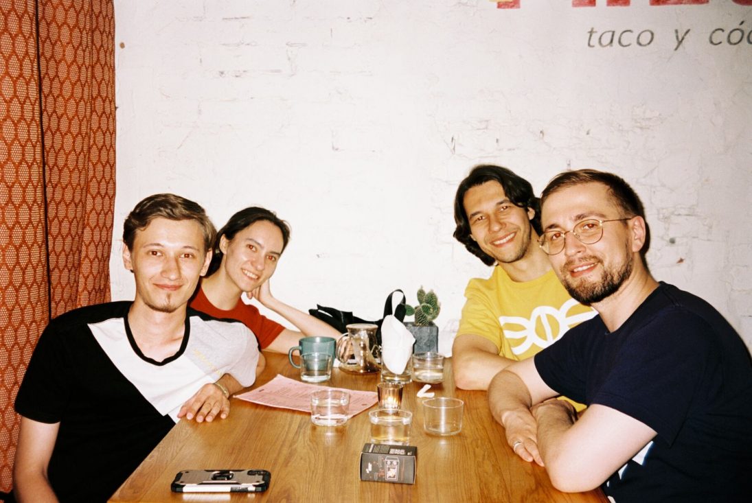
Hey! We’re a design studio of five from Tyumen, Russia. It’s the first city founded in Siberia.
We were an unusual studio from the start and underdogs in the design world by any measure. Despite our small size and living 2,000 km away from Moscow we work with clients from all over the world and various time zones.
Here are five facts about us that have helped us to benefit from being an underdog:
Text-oriented. Most studios are founded by designers. They believe that glowing and bouncing animation will solve a client’s problem. It won’t. But a good and succinct, thoughtful text might. Our founder is an editor, not a designer. We spend most of our time writing. Every project starts with a longread describing what we’re going to do. That’s why our websites and interfaces are well-structured. Words are important, and we’re the most fastidious people when it comes to picking the right ones.
Local identity as a foundation. Most studios bashfully conceal the fact they’re not from the capital. Not us. We talk about it at every corner. We’re proud of being Siberians. We promote Tyumen as a great place for living and creating. We turned patterns of the Tyumen carpet into a sticker pack and designed beautiful postcards with the most beautiful sightseeings of the city. In fact, many clients choose us because we’re more real than our bigger competitors.
Remote & async. Most design studios try to get a fancy and expensive office when they start out. Not us. We started at the end of 2017 and we were remote from the first day of work. Thanks to that we had clients from Moscow, Amsterdam, Berlin, Zurich, and even Toronto. We had people working on our team from Singapore, Turkey, and Hong Kong. Could that be possible if we limited our market to one city? Barely.
Without managers. Most studios have managers who loiter and disturb others by asking stupid questions like, “Is it done?” every ten minutes. We don’t do that. We write long posts and discuss things asynchronously. That compensates for our size and boosts efficiency. Thanks to that we have recently launched our first paid product within four months and only around $5,000 spent. Big companies can’t even imagine this kind of budget for a product that works!
The most dependable. Most design studios spend tons of money on advertising to convince people to buy from them and assure they’re the best in business. But that’s a lie. You can’t be the best at design as design is a very subjective matter. We don’t say such a bogus. We claim the title of the most dependable design team and do everything possible to make it real. We’re never late for a meeting. We send meeting notes within an hour after a call. We finish 95% of our projects on the date we promised.
That was our story for the Underdog Challenge by 37signals. Hope you enjoyed it. Thanks for reading!